Miscellanea

Lokomotiv Kuban presents new logo and game kit

Lokomotiv Kuban Professional Basketball Club presented the new logo and the new game kit for the 2018/2019 season within the framework of 2018 EXPO Basket Official Program.

The new logo is based on a modern sports design which is directed at simplification and minimalism. It keeps to traditions of the sports society but outstands among other Lokomotiv clubs.

The logo was developed by Quberten Studio. The chief designer is Mikhail Antipin who is famous in the sports design world due to logos of Amur and Admiral Hockey Clubs. Along with the logo, the studio developed a package of visual identity, including additional logos, lettering, and the game kit printing design.

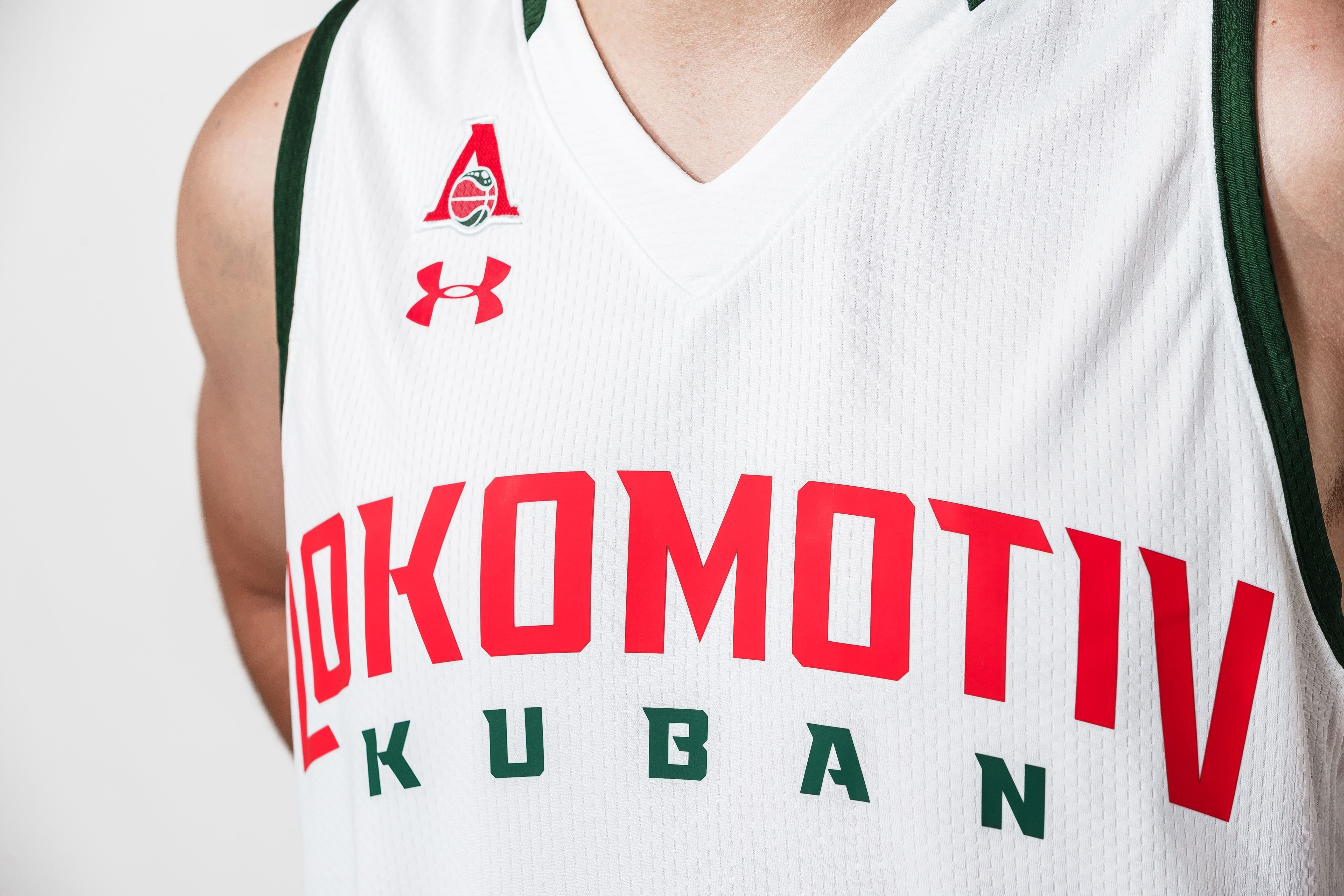
The game kit for the 2018/2019 season with the new logo on it was also dramatically changed. Equipment which was developed in cooperation with the club’s technical partner Under Armour is now fully customized and produced in Loko’s traditional red-and-green colors.

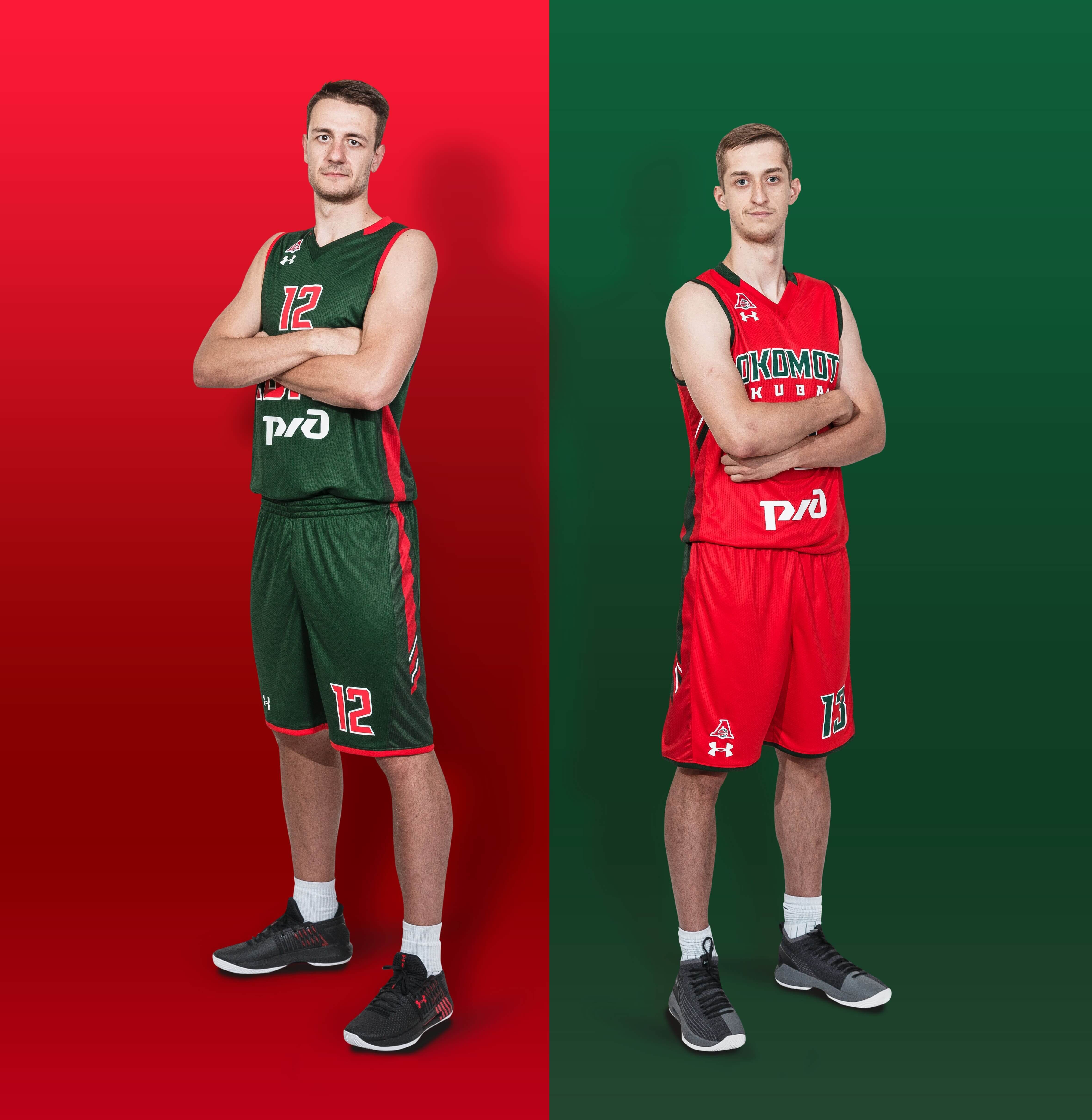
Along with the exclusive design, the kit is technologically innovative. The fabric is ultra-soft and smooth for extreme comfort with very little weight. The material wicks sweat, does not cling to the body and dries very fast. And 4-way stretch construction enables better movement in every direction.

Andrei Vedishchev, President of PBC Lokomotiv Kuban

— For many years, the club's logo was familiar and loved by players and fans of Lokomotiv Kuban. However, today it is not modern and treandy anymore and needs modernization. We held selective tendering for graphic designers and worked on the improved version of the club’s logo in cooperation with Quberten Studio for a few months. As a result, rebranding impacted not only the logo but also our game kit. Our technical partner Under Armour supported us in the intension to create an exclusive Loko game kit for the 2018/2019 season. And today we are glad to present it to the audience. I’m sure the rebranding will make the club’s merchandise modern.

— - One year ago, we proudly announced our first major partnership contract in Russia with PBC Lokomotiv Kuban. It was an intense year for the team that won the Russian Basketball Cup and became the finalist of the EuroCup. Next season, Loko will face different challenges, but undoubtfully the players will overcome any odds because they are fearless and resilient. Good luck to the team in the new season!

— I felt comfortable working with Lokomotiv Kuban. The club gave maximal credence to me. When the creativity is not limited an identity package usually extends. The work creates the icing on the cake beyond the scope of requirements. That is how the club’s favorite gesture was born. In general, a modern club identity shouldn’t be restricted to a logo only. There should be a package, including logos, sublogos, lettering, and so on. The club needs to be equipped for all occasions. When all elements of a game kit are tightly interrelated a solid style of a team appears. Probably, Lokomotiv is the only basketball team in Russia at the moment, which has such an extensive package of the brand identity.

Share with Friends: